

============================
Launch App
2 Seconds median expected load time
http://techcrunch.com/2013/03/12/users-have-low-tolerance-for-buggy-apps-only-16-will-try-a-failing-app-more-than-twice/
============================
============================
Launch App
2 Seconds median expected load timehttp://techcrunch.com/2013/03/12/users-have-low-tolerance-for-buggy-apps-only-16-will-try-a-failing-app-more-than-twice/
============================
Flat design
I'll base my design on these articles below:http://sixrevisions.com/user-interface/when-flat-design-falls-flat/#!http://www.matthewmooredesign.com/almost-flat-design/
Basically, it has been prove that a Flat design got usability problems and lost of consistency. Usability as the users find difficult to see what is clickable and what is not, and consistency... the icons look like made from different designer teams. So, to solve this problem it's created the "Almost flat design", example Google interfaces.
- Actionable elements look clickable or tappable.
- Visual cues.
- Gradients... see Google compose button has a slight gradient saying I'm a button

- Subtle drop shadow => comprehension of depth. Used for overlays or drop downs.
I want simplicity on my design, so the user would focus on content and not being distracted by the over decoration. I would follow the principle of Almost flat design, in order to improve usability and consistency of the Flat design, but in avery subtle way.
============================
IOS 7 Design cheat sheet
http://ivomynttinen.com/blog/the-ios-7-design-cheat-sheet/============================
Usability of iPad Apps and Websites
Source: Raluca Budiu and Jakob Nielsen. Usability of iPad Apps and Websites 2nd edition. Nielsen Norman Group
Usability findings:
- Touchable areas to close or too small
- Accidental activation
- Low discoverability => it doesn't look touchable
- Users dislike typing
- Consistency and standardised = > easy to use.
- Avoid splash screen
- Swipe ambiguity
- Avoid too much navigation
What people use the iPads for?
- Shared devices between families <> ages
- Playing video games
- checking emails
- social networking sites
- watching videos
- reading news
- Media consumption
- Half of people carry their iPad around, the other half use at home or long trips.
Considerations:
- Confusing design
- Do not make the user work more
- Repeat users/ fan based
- Secret weapon => make difference
- Do not use Flash
- Bigger touchable/ spacing links/
- Minimise need for typing
- Grouping relate controls
Touch screen affordances
- Target size 1cm X 1cm
- Space between targets
- Padding in tabular view
- Affordances => touchable should be look like touchable
- Input and registration => people don't enjoy typing
- Ask for the Postcode to get address.
- Offer corrections and short hand typing
- Save history
- Use defaults
- Log in or Log out => depend on sensitive information that is kept
- Use the side of the screen efficiently
- be aware of popovers
- be aware of small modal views (if you have to much content use separate view instead of modal view)
Gestures
- Swiping to turn the page => low discoverability, it can interfere with others elements, take in consideration when design these interfaces:
- Give users visible cues (arrows, tips) that they need to use the swipe gesture.
- Make sure that the page contains enough space safe for swiping next to the two vertical sides.
- Avoid covering the page with carousels and other design features that interfere with swiping.
- Gesture that do no use more than one finger
Navigation
- Introduce a back button when is required, to protect the user from touch accidents, and make it work on the home page.
- Horizontal navigation: The carrusel and horizontal scrolling.
- Carousels are not appropriate for long lists (for instance, for search results).
- Many carousels on the same page can visually overwhelm some users.
- Two-dimensional carousels make it harder for users to remember which items they had already visited.
Orientation
- People prefer Landscape orientation for the iPad, but they will use what fit for them.
- Keep the same content available in both orientations, at both article level and page level. To make the content consistent at the page level, look for natural breaking points (e.g., new paragraph) and keep those in both orientations.
- Keep users at the same location (within the content) when they change orientation. In particular, when users rotate the tablet back to the previous orientation, reestablish the previous view.
- If a feature is only available in one orientation, tell users that they will find extra content by turning the tablet.
Initial Experience
- Download time
- Do not take more that 20 sec => Display a progress bar
- More that 20 sec => Entertain the user during that time
- Splash screens, noise and video
- If you must have one, follow Apple’s recommendation and make it as close as possible to your first functional screen.
- Do not use animations, noises, and videos when the app is launched.
- Instructions and tips:
- If you must use instructions, make them clear and simple.
- Focus on a single feature at the time. Present only those instructions that are necessary for the user to get started.
Workflow
- Not trasnparent enough => what is coming next
- The task flow should start with actions that are essential to the main task. Users should be able to start the task as soon as possible.
- The controls that are related to a task should be grouped together and reflect the sequence of actions in the task.
================================================
- "Good iPad apps are about simplicity and doing a few things well. "
- Take A Goal-Oriented Approach To Simplify Functionality. Embrace simplicity. Give what the audience want
- Leverage What You Know To Create A Fully Personalized Experience. Could you use the user’s location, calendar, Twitter feed or contacts list to make the app smarter and more personalized?
- Think About The Place Of Use.How does that change the list of goals you’ve put together?
- Consider Multi-User And Multi-Device Cases.
- Don’t Do Crazy Navigation Unless It’s A Game Or One-Hit Wonder. People tend to rest their thumb near the top left when holding an iPad, so putting the button there is easiest because then people wouldn’t have to change their grip.
- Provide A Home Page.People are used to home pages that orient them to what’s available and that give them a base of operations. Without one, discovering and browsing content can be disorienting and frustrating. home page to quickly orient users and to introduce the navigation scheme, which is consistent throughout the app.
- Beware Of Awkward Pop-Overs.
- Avoid Gratuitous Splash Screens.
- Use Gestures In Clever Ways, But Don’t Overdo It. the line between effective gestures and gesture overload is fine.
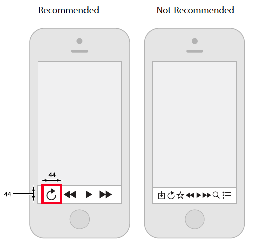
- Make Clear What’s Touchable, And Make It BIG. “read-tap asymmetry,” whereby the font may be legible in size, but the tappable areas are so small that users are prone to missing the targets or are unsure whether the areas are even tappable.
MobileHIG.pdf
Designing for IOS 7
Focus on content and functionality motivate every design decision.:Use plenty of negative space to drag attention
Use key colours = > work well in light and darck background
Consider use the system fonts => App respond to different sizes, letter spacing and line weight.
Consider borderless buttons
- Content is most important
- Legibility of the text, clear icons
- Depth => Visual Layers => convey hierarchy and position.
- Use the whole screen
- UI element should not compete with content
IOS App Anatomy

UI elements UIKit:
- Bars.
- Content views.
- Control.
- Temporary views.
Starting and stoping
- Avoid splash screen or other start up experience, the user can see it a bore every time they will access the App. If it is necessary the splash screen should look like the first screen of the iPad.
- Avoid asking setup information, or minimise... try to take from other source or simplifier the data input.
- If the app is landscape only should launch landscape
- Do not display quit or stop option
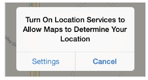
- Display a message/alert when an App feature is not available, for example: Location, WiFi, etc
Layout
- Target min 44 X 44 points
- Space between elements
- Focus on main tasks

- Consistency,
- Visual weight, balance and alignment
Navigation
- Hierarchical: click choice by pages until reach destination

- Flat: options can be accessed from the main pages

- Content or experience drive: navigation define by the content or experience
NOTE: I can consider this for my navigation App, I will check after establish the story. I want to use people witness report to build the victim path

Navigation Tips:
- User should know where they are
- Navigation Bar => show user current position in the hierarchy

- Tab Bar => support flat navigation, display several categories of content or functionality. Translucent and appear at the bottom edge os the screen.

- Page Control => Show how many items are available.

- Segmented Control => can display different views, it doesn't enable navigation to new screen

- Toolbar => Similar to Navigation or Tab but it doesn't enable navigation, the user act on content in the same screen

- Consider the use of temporary view:
- Modal view

- Action sheet

- Alert
Toolbars and navigation buttons:


Tab bar buttons:


Content View
- Collection view

- Slip view Controller => two side by side controllers

- Image View => same size and scale
- Map View => give the user and interactive view of a geographical area. Routing App to give directions, display users (see routing apps I might don't need the wifi http://izeize.com/mapsplus/)

- Popover (contradiction with Nielsen) => display additional information/list, Action sheet with options or Content in a slip view.
- Table View

Controls
- Activity indicator => show task or process is processing
- Progress view => show progress of a task or process that has a know duration
- Slider
- Switch


iPad Settings


Gestures


===============================
Interactive design
UI Principles for Great Interaction Design
Design an iPad app UI in Photoshop
http://www.creativebloq.com/app-design/design-ipad-app-ui-5132672
http://www.creativebloq.com/web-design-tips/tips-ui-design-123474
http://www.creativebloq.com/web-design-tips/tips-ui-design-123474
http://ivomynttinen.com/blog/the-ios-7-design-cheat-sheet/
A comprehensive guide for IOS design
http://taybenlor.com/2013/05/21/designing-for-ios.html
================================
30 days trial
http://www.infragistics.com/products/indigo-studio?utm_source=uxbooth&utm_medium=june-tweet+&utm_content=Indigo&utm_campaign=Indigo-Product
=================================


"Route-Me is an open source map library that runs natively on iOS. It's designed to look and feel much like the inbuilt iOS map library, but it's entirely open, and works with any map source."
https://github.com/route-me/route-me
Wireframing
http://www.infragistics.com/products/indigo-studio?utm_source=uxbooth&utm_medium=june-tweet+&utm_content=Indigo&utm_campaign=Indigo-Product
=================================
iPad Features
Location
It use Wifi or GPS enable devices. http://support.apple.com/kb/HT5594
"Important: Maps, directions, Flyover, and location-based apps depend on data services. These data services are subject to change and may not be available in all areas, resulting in maps, directions, Flyover, or location-based information that may be unavailable, inaccurate, or incomplete. Some Maps features require Location Services. " http://manuals.info.apple.com/MANUALS/1000/MA1595/en_US/ipad_user_guide.pdf
My iPad rely on using Location services in order to be able to guide the user through the area. I researched that the iPad for positioning contain a compass and use the service Skyhook Wireless http://www.skyhookwireless.com. There are already Apps that use this technology http://www.skyhookwireless.com/location-technology/featured.php. It's as precise as GPS.

I think it could be better to use a wifi in the area with some restriction that only can be use to share data from the App.
Three axis gyro

Ambient Light sensor
"Route-Me is an open source map library that runs natively on iOS. It's designed to look and feel much like the inbuilt iOS map library, but it's entirely open, and works with any map source."
https://github.com/route-me/route-me
in order to promote your application for the iPad you can use the app store reviews service. which will help you in promoting the application by buying reviews
ReplyDelete